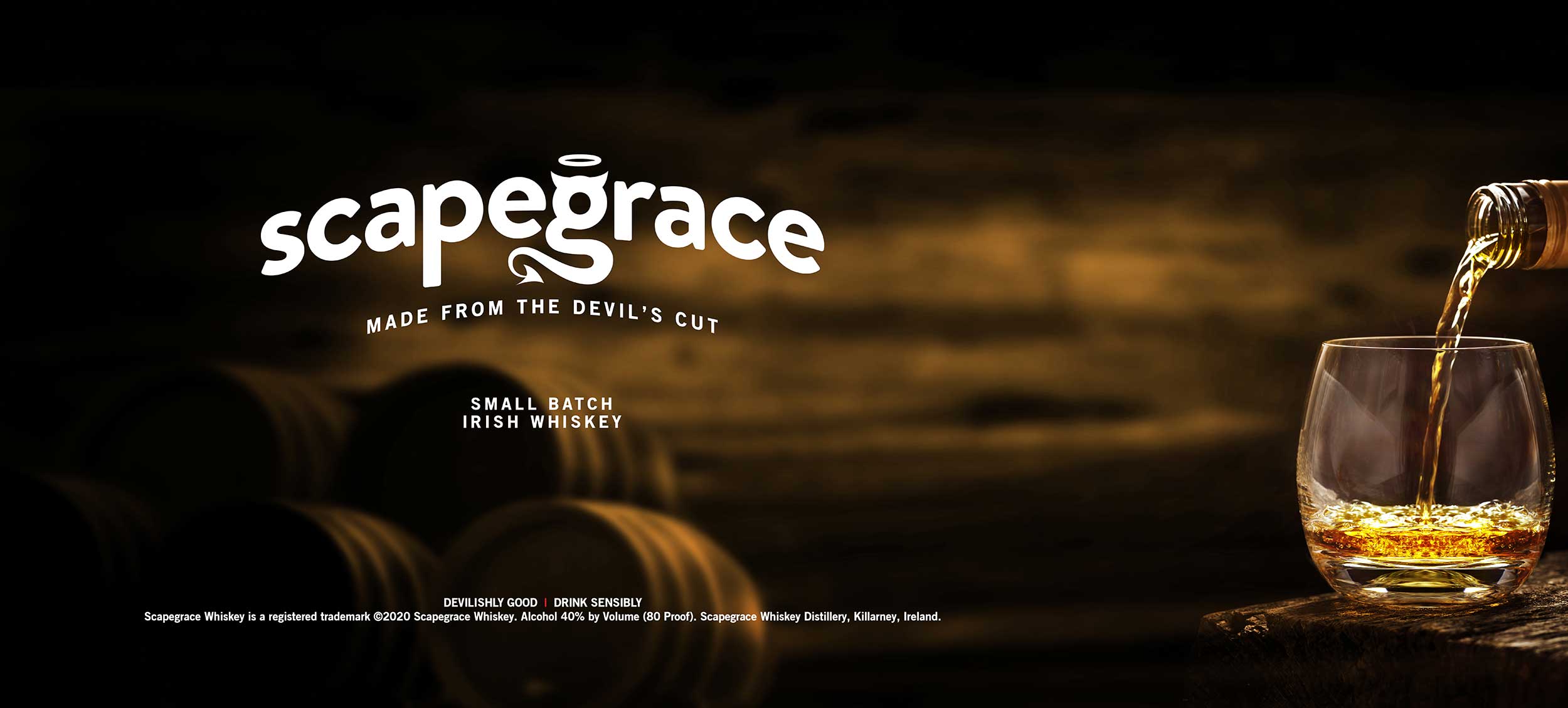
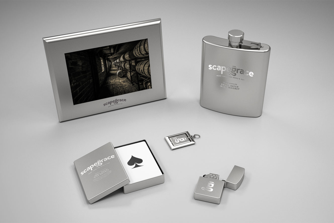
Scapegrace
Whiskey Branding Design
Scapegrace Whiskey is based on the maturation step of the whiskey making process.
During maturation, the flavors of the spirit combine with natural compounds in the wood cask and this gives the whisky its own characteristic flavor and aroma.
Also, during this time a percentage of the spirit is lost through natural evaporation. This is called the ‘angel’s share’. Another percentage is absorbed by the barrel the spirit is aged in and this is called ‘the devil’s cut’. This is what Scapegrace Whiskey is based on.
Evasion of Grace
Classic · Modern · Edgy
Scapegrace means ‘evasion of grace’. The whiskey is not simply from the barrel but extracted from the walls of the cask. It evades the grace of the angels’ share and so becomes what is known as the devil’s cut.
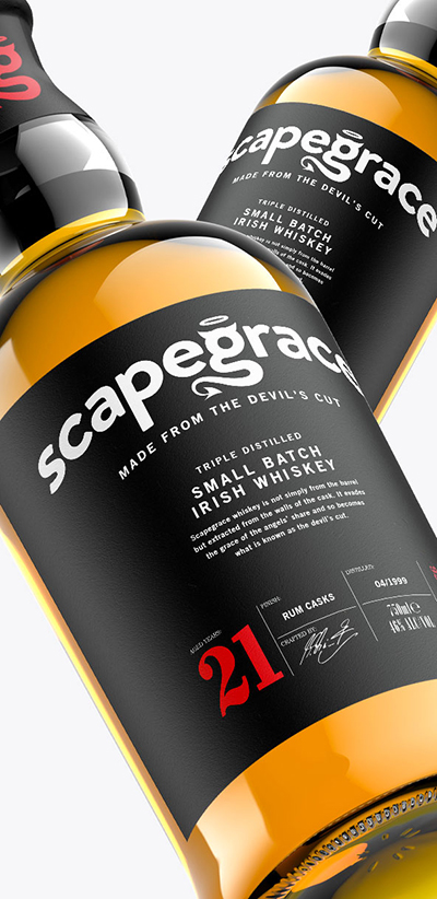
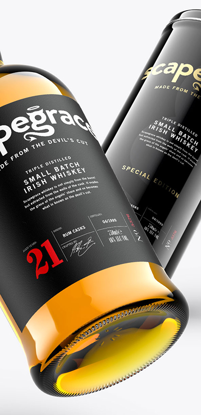
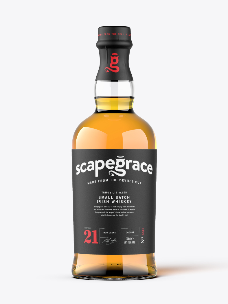
The ‘g’ in Scapegrace represents the maturation step of the whiskey making process. It features an angels halo and the devil’s tail.
The brand is sophisticated and aimed towards the experienced whiskey consumer.
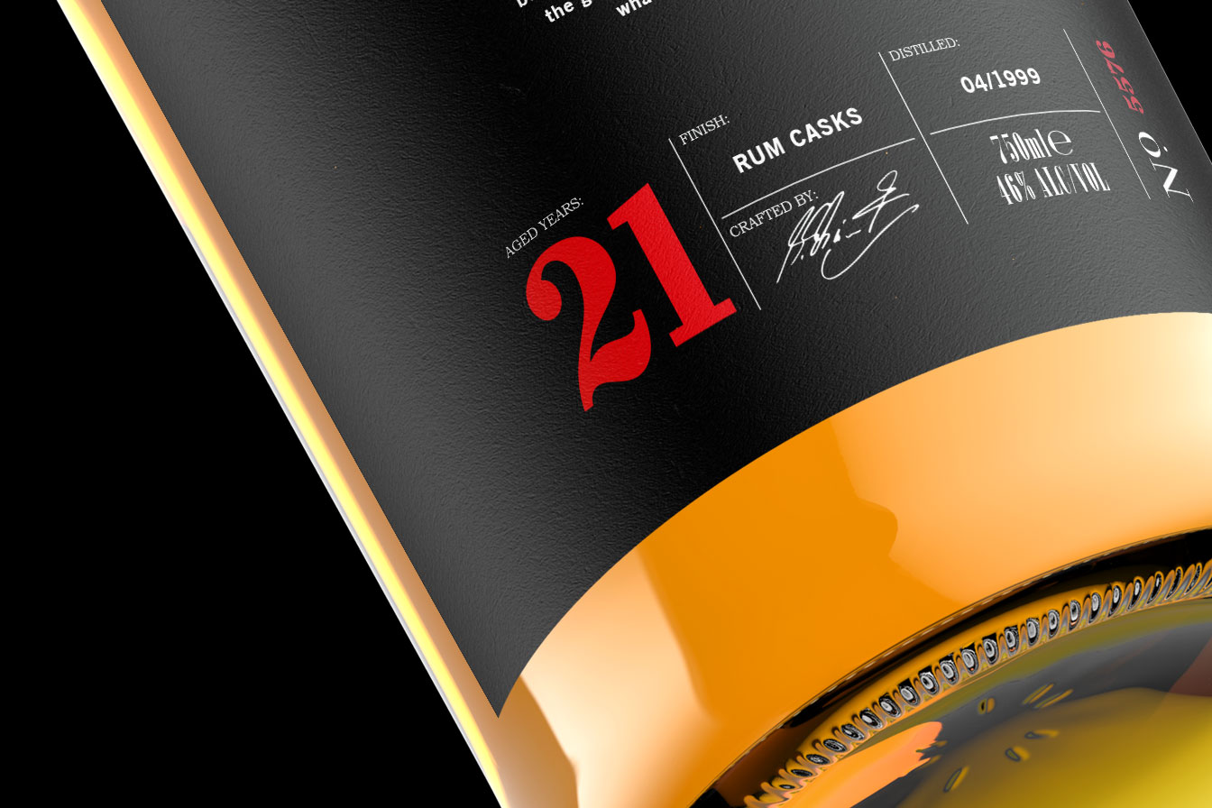
The label design is modern-classic featuring important information to the whiskey connoisseur.
The black label represents the serious and dark nature of the brand concept and is intended to appeal to the like consumer.
The Target Audience
Something that appeals to them. The maturation process is important to the unique characteristics of the whiskey created in the cask, and that essence is captured through the look and feel of the imagery and stereotypes used.

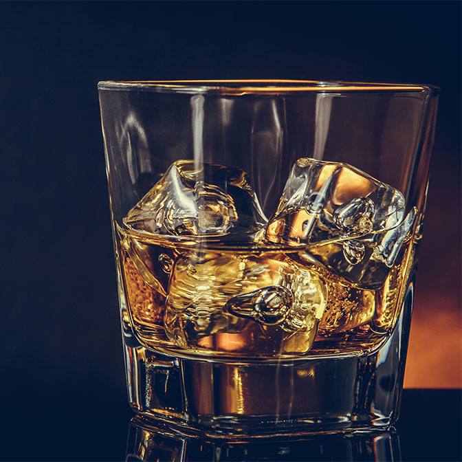
We want the target audience to associate themselves with this brand and relate to it. This is key to creating a successful brand experience that people want to be a part of.